
Welcome to the new-look Mythaxis Magazine!
It’s been six years since new management took over, and the first thing we did then was give the site a more modern edge. But the times they keep a-changin’, so we thought it was time to give our facelift a facelift. Since our last issue came out, we’ve been scrambling behind the scenes to have things in place for the spring issue, and here we are!
[Honesty filter applied: tech-guru Marty Steer has been scrambling; the editor merely continued peeling grapes and issuing regal orders from the chaise longue while the inevitable revolution gathers steam.]
Although the changes apply to reading on both large and small screens, our main focus was on making the mobile user experience feel a little more app-like. I was going to spell out all the little changes, but instead I think I’ll let them speak for themselves.
With one exception! Front and centre of the redesign is the new Mythaxis icon, which you can see large as life below! Reminiscent of an atom or, more specifically, an orrery, it is inspired by a real-world monument to the memory of our founding editor, Gil Williams, erected by his wife Beryl. This icon (and a variety of the others that now decorate our stories) were created by past and future fiction contributor Addison Smith, who also does visual design in the publishing sphere.
So, many thanks to Addison – and of course to Marty, without whom none of this at all!
Another note of gratitude goes out to Micah Hyatt, who for almost all of the last two years has been providing Mythaxis with its voice. The first occasion was in Issue 37, when he narrated his own short scifi story; since then, he’s produced audio for every single story in the zine, and narrated all but two of them as well.
With this issue, he’s also gone a little further. If you’re interested in pulling back the curtain, at the end of five of this issue’s stories we link to videos of Micah’s cold-reads: a warts-and-all glimpse into the recording booth, where the hard work happens (the magic happens later). We recommend you enjoy the finished products first, of course!
But why only five of the stories? Well, for just the second time yours truly has stepped up the mic, strategically making my far inferior recording resources work to the story’s advantage (or, at least, not to its disadvantage). Sadly, that means there’s no behind-the-scenes footage for that one. On the other hand, since I have a face for radio and a voice for the silent movie era, that might be a good thing…
We’re going to continue tinkering with the site, but to balance what we add it’s time to take something away. As I mentioned towards the end of last year, I’m bringing an end to the editorial “feature” in future issues. We may add a short afterword if we have interesting news to share, and perhaps I’ll write an annual editorial if the urge takes me, but as a standard element of the zine they are no more.
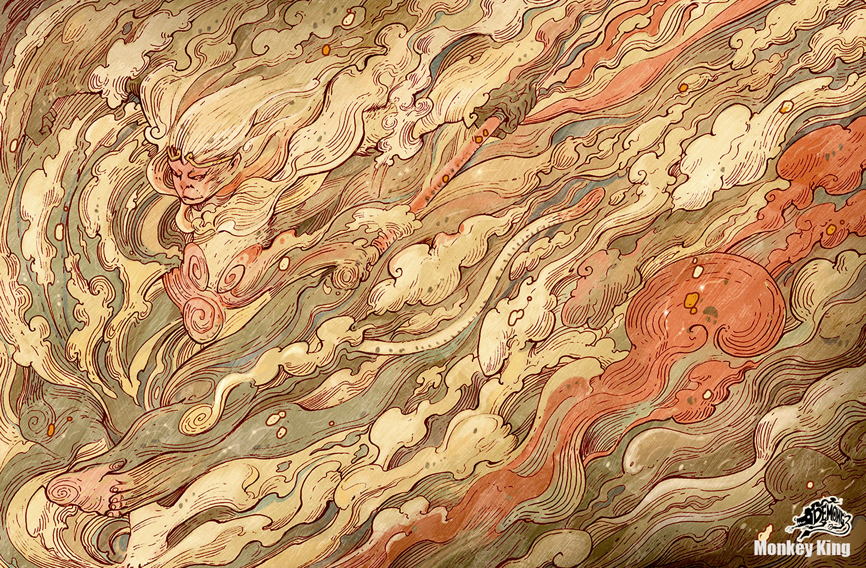
However, as this used to be where I’d salute the generosity of our cover artists, I’m going to mention one more change in the new format: from now on, the About page on the issue’s menu acknowledges the current cover artist alongside our permanent members of staff. So if you want to know more about Narupiti Harunsong, who created this issue’s thing of beauty, go take a look.
Okay, preamble enough – time to read some stories, if you haven’t already!